Since national and state flags represent a broad range of people, their designs usually incorporate very general symbolism and non-contentious history, such as the founding of a nation or the state’s most important natural resource (water, in a lot of cases). City flags are a bit different. Being that they are a microcosm of a larger entity with more specific cultures, city flags tend to get a bit more specific. As you will see in this ranking, this can be a good thing or a very bad thing. Sure, you’ll find plenty of city flags with seals, but you’ll also find many that fit into a very broad “other” category that bend and break the rules of good flag design.
For this ranking, I chose to define “big” as the top 50 cities by population.
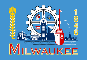
50. Milwaukee, WI
Readers of our World’s Weirdest Flags series will be no stranger to this one. The one thing that Milwaukee’s flag has going for it is that it sure is distinctive. However, this is also the perfect example of what I like to call “committee flags” – a flag that was designed by a group of people or a single politician with the goal of fitting in as much symbolism as possible. They tried to cram so much in this flag that there is a flag within this flag! (bottom right quarter of the gear). Luckily, a Milwaukee graphic designer has started a contest to come up with a new design.
49. Oklahoma City, OK
Normally I give flags with seals on a white field a higher ranking than those on blue fields, simply because there are so many of the later. However, this flag might as well be a bed sheet because its design is putting me to sleep.
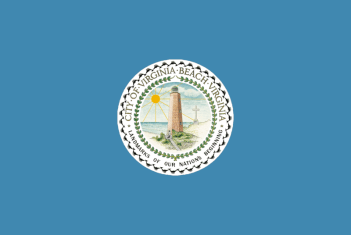
48. Virginia Beach, VA
Small city seal, blue field – need I say more? There were multiple times where I had to zoom in on this flag just to remember which city it represented.
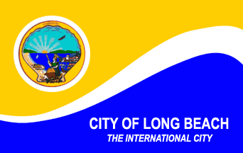
47. Long Beach, CA
I’m not particularly wild about this flag’s field. The beach symbolism is a bit “on-the-head” and it looks very MS Paint to me. However, if they had left it at just the field, I would have ranked it much higher. But no, the had to ruin it with a city seal and way too much text.
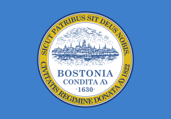
46. Boston, MA
Another of what the industry calls a “seal on a bed sheet,” or what I like to call a “seal snoozer.” At least the seal is large enough where you can read it. However, even the seal itself is pretty boring. Zzzzzzz….
45. Atlanta, GA
As far as seals go, this one could have translated to a flag better than most. I wish there was a bit more contrast between the seal and the phoenix rising from the ashes (in reference to the city rebuilding after the destruction of the Civil War). Unfortunately, the phoenix really blends in to the rest of the seal, especially when viewing from afar.
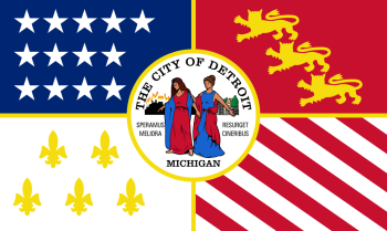
44. Detroit, MI
Oh Detroit… You tried. “A” for effort. The four quadrants are supposed to represent the nations that have ruled the city (Fleur de Lys for France, three lions for England, and stars and stripes for U.S.A.). It’s amazing to me how a quartered flag can either work (such as Maryland) or not (this). Granted, there is symmetry and no seal on the Maryland flag, but it seems that quartered flags just need to have a certain magic touch to work.
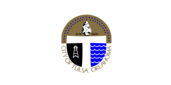
43. Tulsa, OK
This “seal snoozer” at least has the benefit of having the big “T” to give you an idea of what city it might represent. But otherwise, this is largely forgettable and a bad combination of colors.
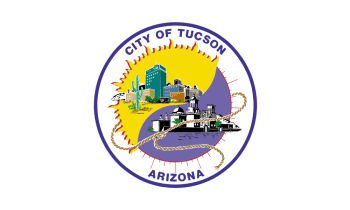
42. Tuscon, AZ
Luckily the seal is large enough to read on this flag. I actually do like the quirky-ness of the seal, but it’s way too complex for a flag.
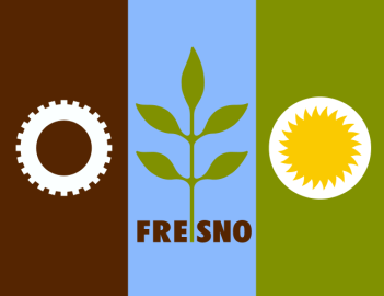
41. Fresno, CA
When I first saw this flag, I immediately though of an early 21st century infographic. Gear+sun=Fresno plant. But beyond the strange design, the color palette is not very pleasing.
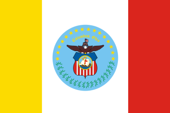
40. Columbus, OH
This starts flag starts off a series of what I have dubbed the “unfortunate tricolors.” They all are defaced with small and/or boring seals and have a bland color palette. I’m not a fan of the yellow, white, and red color palette. Yellow and red work well together (i.e. the Spanish flag), but when white is included in the mix it doesn’t look as good. Plus that seal is just horrible and way too large.
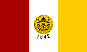
39. San Diego, CA
I give San Diego a higher rank than Columbus since the seal is a little more classy and the color palette is a reference to the city’s Spanish past. I like the Spanish flag and it’s color palette, but again, throwing white into it just doesn’t work for me.
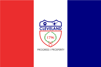
38. Cleveland, OH
Would you believe me if I told you that this flag was designed by a high school student in 1895? Well you should, because it was. Its about as generic a city flag as they come.
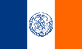
37. New York, NY
For a city that attracts so many artists, you would think that someone would have started a movement to redesign New York’s terribly boring flag. Well, scratch that. If you search online, plenty have taken a stab at it. I do like that the color scheme recalls the city’s Dutch heritage, but there are so many other ways to do that.
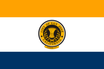
36. San Jose, CA
According to records, the original San Jose flag was just a plain white field with the city seal. This variant was designed by a police officer in 1976 to serve as a temporary flag celebrating the country’s bicentennial. It’s not exactly clear if this variant stayed because people liked it or that they just forgot to switch back. Either way, it’s an improvement over a white field, but still uninspired.
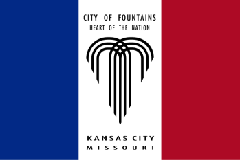
35. Kansas City, MS
This ranks the highest in my “unfortunate tricolors” series because it’s not defaced with a seal! However, all the text really detracts from design. Plus, with something so original as the heart/fountain symbol, this was the best you could come up with? This is just begging for a redesign.
34. Fort Worth, TX
Is this a good flag? No, not really. However, I kind of like it. It’s big, bold, and very Texas. I would love to see a redesign incorporating just the longhorn.
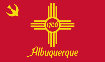
33. Albuquerque, NM
It is generally seen as a positive when a city take inspiration from a state’s flag. Albuquerque had a great template to work off of with New Mexico’s flag. But, in my opinion, they really missed the mark. To me, this design is the equivalent of buying a beautiful luxury sedan and putting a bunch of bumper stickers on it.
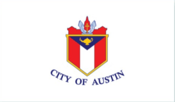
32. Austin, TX
Despite a city seal flag with text, this flag spoke to me a bit. I think its the shape of the seal that does it for me. Don’t get me wrong, they could do so much more with an interesting design like that. But I don’t hate this flag.
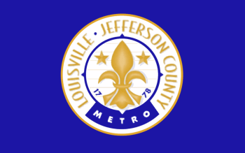
31. Louisville, KY
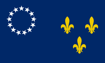
The city of Louisville was done a major disservice when it merged with Jefferson County in 2003. It adopted this flag. Why was it a disservice? Because this used to be Louisville’s flag.
Louisville was named after Louis XVI due to France’s support during the American Revolution. Hence the three fleur de lys along side the 13 stars honoring the original colonies. Is it an amazing design? No, but it’s certainly better than what they have now.
30. Nashville, TN
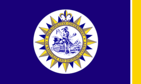
This flag draws inspiration from the Tennessee state flag by adding the strip of color to the edge of the flag’s fly. That’s a good thing. But other than that, it’s just another “seal snoozer.”
29. Las Vegas, NV
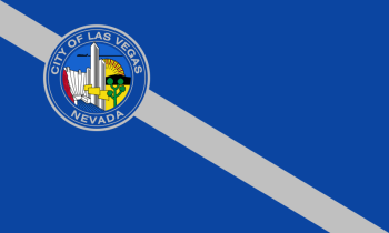
Another city drawing inspiration from it’s state flag (the upper left positioning of the seal). I actually like this better than Nevada’s flag, simply for the diagonal stripe. It makes the off-center positioning of the seal look much more purposeful.
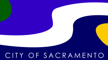
28. Sacramento, CA
While certainly better than using a seal, flags with wavy lines always look more like a local tourism board logo than a flag.
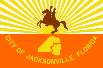
27. Jacksonville, FL
I was speechless when I first saw Jacksonville’s flag. It’s hideous, yet I love it. From a design standpoint, there’s too much of everything… Yet it just feels right for some reason. It’s clearly not in the upper echelon of city flags, but I would take this any day over a “seal snoozer.”
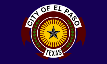
26. El Paso, TX
Another “bigger is better” Texas design. It’s big, legible, and not quite a seal. That makes it a decent flag amongst these competitors.
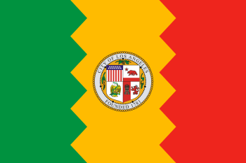
25. Los Angeles, CA
Los Angeles starts of the second series of tricolors that just work better than the others, for one reason or another. The color combination is decent and the seal is somewhat interesting. The zig zag pattern definitely makes it easy to recognize, but it feels like it’s trying too hard to stand out. It also makes the seal look off-center for some reason.
24. Philadelphia, PA
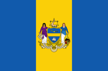
Ah Philly, the city where I grew up. It has a nice color palette which makes it easy to recognize. And the seal isn’t confined in a circle, which is somewhat refreshing. But it’s still a city seal. I really wish I could say we had a better flag, but for now it’s just “alright.”
23. Miami, FL
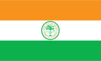
Despite potentially being confused with the flag of India, this color palette just feels very Miami. The seal, while very small, doesn’t intrude and blends well into the design.
22. Raleigh, NC
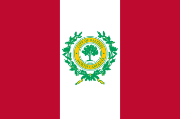
Unlike Miami’s flag, the red, white, and green color scheme is not the first that comes to mind when I think of Raleigh. However, it a classy and interesting take on the tricolor. The laurels add a nice touch.
21. San Francisco, CA
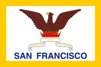
If you’re a listener of 99 Percent Invisible (which you should be), you probably have seen, or at least heard, of the San Francisco flag and Roman Mars’ disdain for it. Yes, the phoenix is a pretty goofy design. And yes, there’s a lot of text going on in this flag. However, when you compare it to the field of flags in this ranking, it’s certainly easy to distinguish.
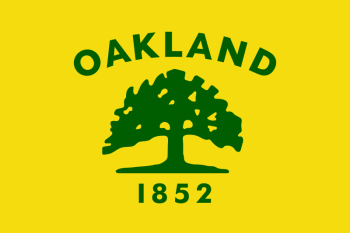
20. Oakland, CA
I liken this quirky “on-the-nose” symbolism of an oak tree to Washington state’s flag (that features George Washington’s face). I find it endearing. Plus it has a nice color palette.
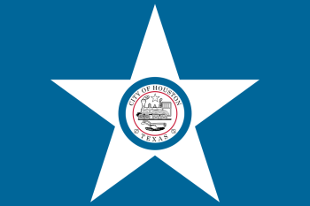
19. Houston, TX
This is a flag only Texas could get away with. And I love it. The bold star instantly makes what could have been a “seal snoozer” into something memorable. So memorable in fact…
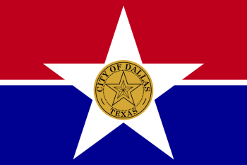
18. Dallas, TX
… that it has become a running motif in several Texas city flags. From what I could find, it seems that Houston was the first to use the large star. Dallas improved upon it by adding two colors to the field…
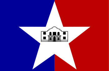
17. San Antonio, TX
…and San Antonio made it even better by removing the text. When you have the Alamo, you don’t need text.
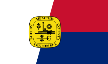
16. Memphis, TN
Memphis get’s points for originality on this one, at least as far as the field is concerned. There’s no real reason why the white portion is slanted. The original design had the white section completely vertical, making the sections similar in proportion to the Texas state flag. The slant redesign came in 1969, so I’ll let you make your own joke about that.
15. Minneapolis, MN
Again, points for something different here. It’s nothing too exciting, but it’s clean and original.
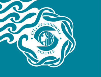
14. Seattle, WA
Here is where the list finally starts to get interesting! Yes, Seattle’s flag does have a seal on it, but the waves in the upper left quarter make this design refreshing and unique. It was actually designed by a city council member in 1990. Good thing they left the design to only one city council member, otherwise we would have another Milwaukee on our hands.
13. Omaha, NE
I couldn’t find much information at all on Omaha’s flag. There aren’t even any high resolution renderings available. Despite that, this is a pretty solid design. I might have forgone the addition of the covered wagon, but I don’t think it detracts from it.
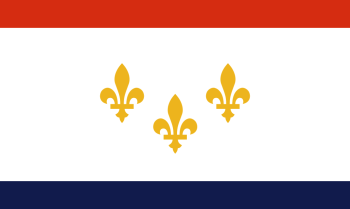
12. New Orleans, LA
I like the fact that New Orleans’ flag doesn’t go with the traditional tricolor dimensions, but I wish the Fleur de Lys filled a bit more of the negative space. But despite that, it’s a clean design that honors the city’s French heritage. That gives it high marks in my book.
11. Colorado Springs, CO
While not directly sharing elements, this flag feels similar in design to the Colorado state flag – Mainly the offset focal point of the simple mountain and sun renderings. Surprisingly, this flag was originally designed in 1914. The clean design combined with the fact that it’s lasted over a century maks it a winner for me.
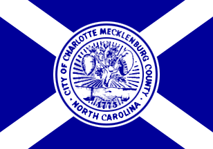
10. Charlotte, NC
I know what you’r thinking… How the hell did this flag make it to the top 10? The reason is that I didn’t really judge Charlotte by this flag. Even though that is the official flag…
…this is the flag that is used by Charlotte. Even the city’s central government building flies this flag (they do keep an official Charlotte flag inside the city council chambers). The crown represents all city agencies coming together to work for the benefit of the citizens. I think they need to stop beating around the bush and make this the official flag already.
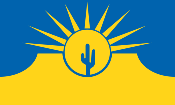
9. Mesa, NM
This flag is a relative newcomer, officially adopted in 2005. The design manages to paint a great image without being too complex and only using two colors. Such a feat deserves high praise. Also, it replaced this clunker of a flag, so we should all be thankful.
8. Phoenix, AZ
Out of the three flags on this list that feature a phoenix, this is certainly the best (which is fitting since it is Phoenix). A simple two color design that gets the message across beautifully. City councils, take note! This is how it’s done!
7. Indianapolis, IN
The symbolism in Indianapolis’ flag is a bit more abstract that Phoenix’s phoenix, but it’s a clean, classic, and very American design. There is meaning to the star and the color choices, but basically it boils down to that Indianapolis, the Indiana state capital, is in the center of the state.
6. Denver, CO
Colorado really has their stuff together when it comes to flags. Another simplistic, yet classic design with clear symbolism (I hope I don’t have to explain this one to you).
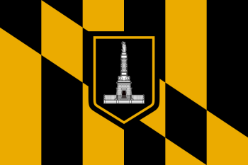
5. Baltimore, MD
This is the best example on this list of a city incorporating the state’s flag design into their own flag. And with good reason – the black and yellow ramparts come directly from Lord Baltimore’s coat of arms. Yes, this flag does have part of the city’s seal on it, but it is just a minor part of the flag compared to the many of “seal snoozers” where the seal is the only part of the flag.
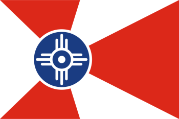
4. Wichita, KS
When compared to the Kansas state flag, the quality and creativity of the Wichita flag is surprisingly good. The rays coming from the offset sun represent freedom while the blue represents happiness. The symbol in the middle is an Native American symbol that translates to “hogan” or “permanent home” in some Native American languages. With such a unique design, you’d figure that this flag would be a part of the fabric of Wichita’s culture. Unfortunately, research seems to suggest that the flag isn’t very well known. Take pride in your flag, Wichita!
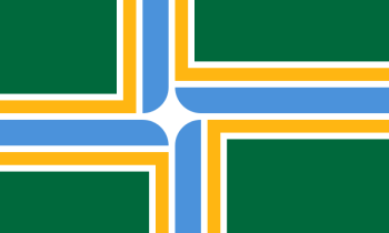
3. Portland, OR
Listeners of 99 Percent Invisible should also be familiar with Portland’s flag, as Episode 140 tells the story of how it was made. Instead of giving you a simplified version of the story, I encourage you to check out the 99 Percent Invisible episode and listen to it in its full glory.
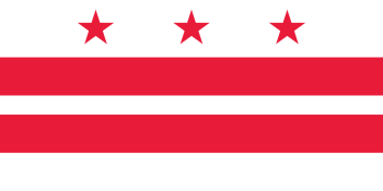
2. Washington, D.C.
There are two main design motifs that people use to represent Washington D.C.: 1. A diamond, in reference to the district’s boarders. 2. Three stars, as seen on the city flag. How did the District of Columbia get such a great flag? They can thank George Washington. The flag uses his coat of arms.
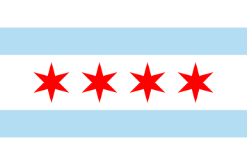
1. Chicago, IL
Chicago’s flag, first designed in 1917, is a classic for a two reasons. One is that it’s a wonderful and clean design. But unlike any of the other flags on this list, it is directly connected to Chicago’s people in a very unique way: it is a virtual timeline of the city. Each of the stars represent a pivotal point in Chicago’s history. The original 1917 design only had two stars: One representing the Great Chicago Fire of 1871 and another representing the World Columbia Exposition of 1893. A third was added in 1933 to commemorate the Century of Progress Exposition that opened that same year. The last star added is technically considered the flag’s “first star” as it was added in 1939 to represent Fort Dearborn, the first settlement in what is now Chicago. A fifth star has been proposed several times (including if the Cubs win the World Series).
