
This is a fun post for me to celebrate the launch of this website. It doesn’t have many flag facts (I’ll save them for individual state flag posts) but it will give you an insight to my opinions of flag design. My father is a graphic designer and I have done a fair amount of professional graphic design work myself (check out that sweet logo!), so I have spent my whole life looking through the world with a graphic designer’s lens. Therefore, I have some pretty strong opinions on what makes a good flag, most of which are hinged on two simple rules.
- They should be simple in both color selection (3 colors max) and design.
- They should be easily legible/recognizable at a distance (this means that state seals are a no-no).
However, as with art and design, there are always exceptions to the rules.
This post was harder to do than I expected. Choosing my favorites wasn’t the issue, there are just so many bad state flags that it was difficult to decide which was worse. Nearly half of the state flags are the states seal on a blue field so your going to have to do some scrolling before you reach the good ones…
50. Montana

State seals just don’t work on flags. They are too detailed and often too similar to easily distinguish from one another. This is especially true on a piece of fabric waving in the air, seen from a distance. That’s not to put down all state seals as some are very beautiful. Montana’s seal is not one of those. It looks like it was made in Microsoft Paint. The text, reminiscent of a high school sports banner, is the icing on the cake of terrible.
49. Kansas

The only reason that Kansas beat out Montana is that it has a sunflower on top of it’s terrible seal.
48. Wisconsin

While Wisconsin has a somewhat decent seal, the font makes it look more at home in a high school gymnasium than atop a state capitol.
47. South Dakota

At least the text placement is somewhat interesting. The colors combined with the monochrome seal are terrible though.
46. Vermont

Here’s the point in the list where most of the flags are virtually indistinguishable to a vast majority of people. Vermont’s state seal is centered by a very uninteresting tree.
45. Maine

Hey look, another tree! At least this one has people in the seal that reflect Maine’s history. Also, the “Maine” font in the ribbon is one of the better presentations of a states name. However, it is of my opinion that state names, or text in general, shouldn’t be on flags.
44. New York

More seals on more blue backgrounds. At least this is more of a landscape than a single tree.
43. Virginia

Virginia’s flag is pretty boring, but at least it has murder.
42. Kentucky

I give Kentucky credit for trying something different with the font. Too bad it’s a terrible font.
41. Utah
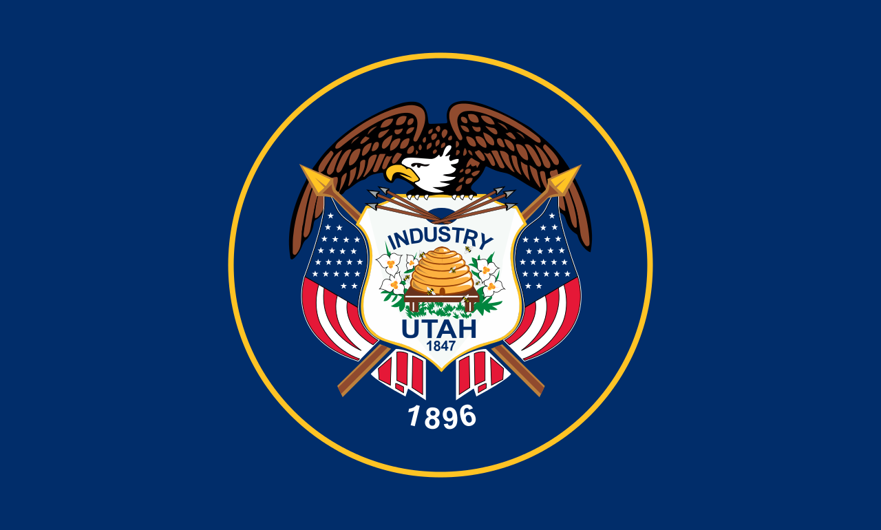
Utah’s seal is nice, but its too similar to any number of generic U.S. government seals.
40. Idaho

Here’s where the seals start to get a little bit better, even if they are still on a blue field. It’s too bad that Idaho’s colorful seal is so small on the flag.
39. Nevada

I also give Nevada credit for trying something different. While it’s extremely boring, at least this is recognizable for the seal’s placement… And its dullness.
38. Nebraska

Nebraska’s flag features a large seal making it easier to distinguish. And it has a train in it which is always a plus in my book.
37. New Hampshire
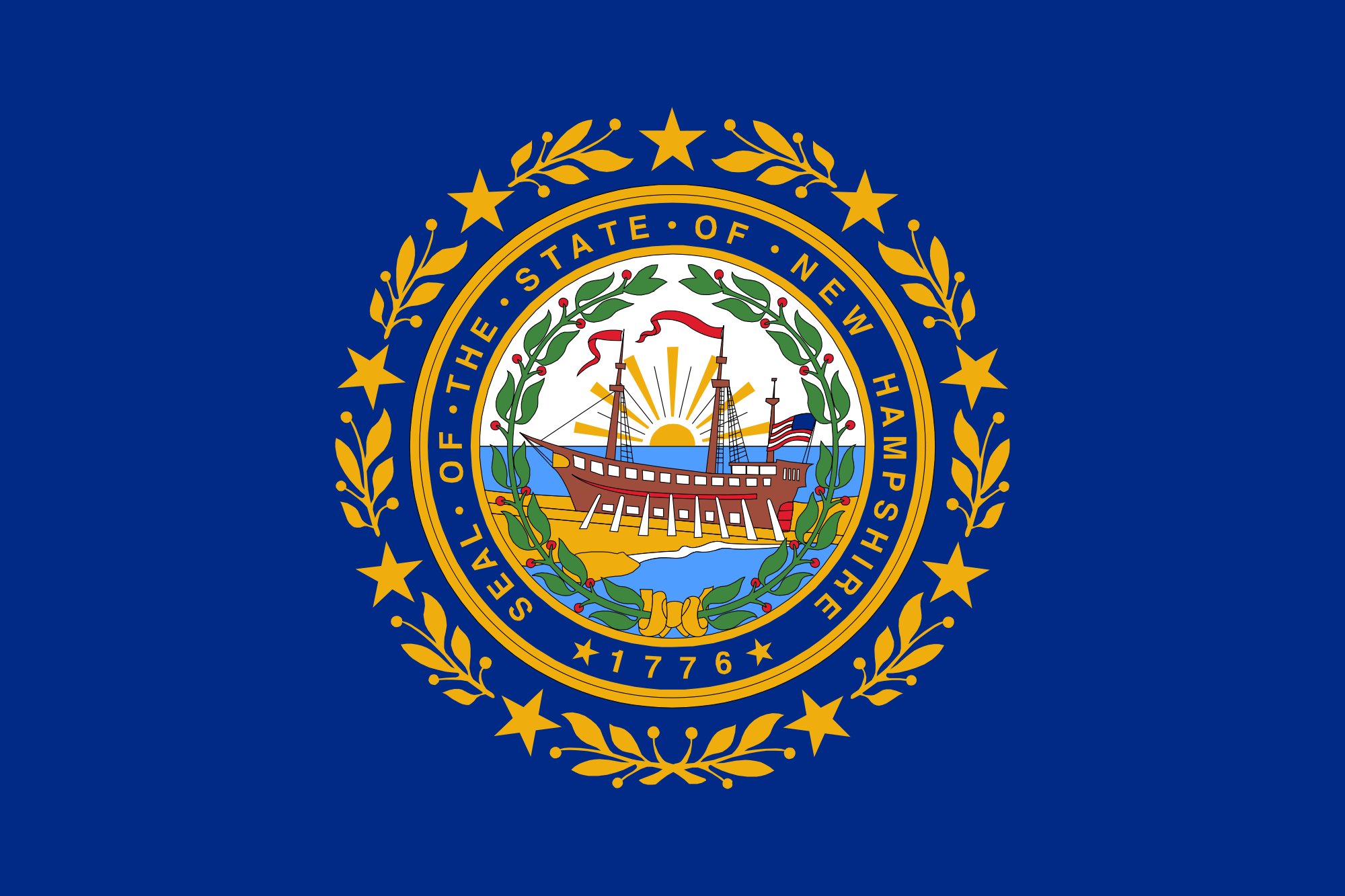
New Hampshire’s flag features another large seal with some added color, stars, and ornamental leaves. Unfortunately, it’s still a seal.
36. Michigan

Now we start seeing some rampant animals, one of my favorite elements of European family coats of arms. Unfortunately, the elk and moose make it look silly.
35. Pennsylvania

The only other rampant animals featured in state flags. This time it’s horses which are much better than the elk and moose. However, I think rampant animals should be left in Europe.
34. Connecticut

While not my favorite state seal, the Connecticut seal’s simple color palate and large size translate well to this flag and makes it my favorite of the flags with state seals on a navy blue field.
33. North Dakota

While the iconography isn’t very original, it works decently on the navy blue field. Also, it’s not a state seal which is a plus.
32. Minnesota

Finally something other than navy blue! Unfortunately just a lighter shade of blue. While some of the colors do pop, it’s a bit of a strange color palate to me.
31. New Jersey

Having been born and raised in New Jersey, I am very familiar with this flag and it’s hideous pale yellow field. As a child, I always thought it was the one of the worst flag designs. Now, I appreciate it a bit more, simply for the fact that it’s not on a blue field.
30. Washington

Washington’s seal is so on the nose that I find it goofy and endearing. However, it’s still just a state seal.
29. Massachusetts

While still just a state seal, this design really works well with the white field.
28. West Virginia

The West Virginia flag wouldn’t work as well if it didn’t have the blue border.
27. Arkansas

Here is where the flags truly become distinguishable from one another. Arkansas’s flag looks like a retro gas or oil brand. To me, it isn’t bad but it doesn’t necessarily work as a flag.
26. Missouri

The first in the list to employ stars and stripes. Unfortunately the seal isn’t much to write home about.
25. Delaware

In the spirit of full disclosure, I was a resident of Delaware for 7 years and grew to like its flag. It’s pale blue combined with the seal inset within the yellow diamond works pretty well for a state seal on a flag.
24. Iowa

Iowa’s flag, while visually boring, honors both its French and American heritage pretty well.
23. Florida

Florida’s flag incorporate’s the state’s Spanish heritage well, even with the state seal.
22. Louisiana

I give a lot of credit to Louisiana for having such a unique state seal and not feeling the need to enclose it in a circle on its state flag.
21. Illinois

Another state seal that works well on a white field.
20. Oklahoma

While I tend not to like flags with such bold text (as shown in the beginning of this list) I enjoy Oklahoma’s unique iconography a lot.
19. Oregon

You may be wondering how a flag that looks like this got so high on my list. It’s because of this:

Our country’s only two-sided state flag! There were some former two-sided state flags in the past but Oregon’s is the only one at the moment.
18. Mississippi

Say what you will about the Mississippi flag’s canton, but the flag itself is a clean design without any unneeded text.
17. Tennessee
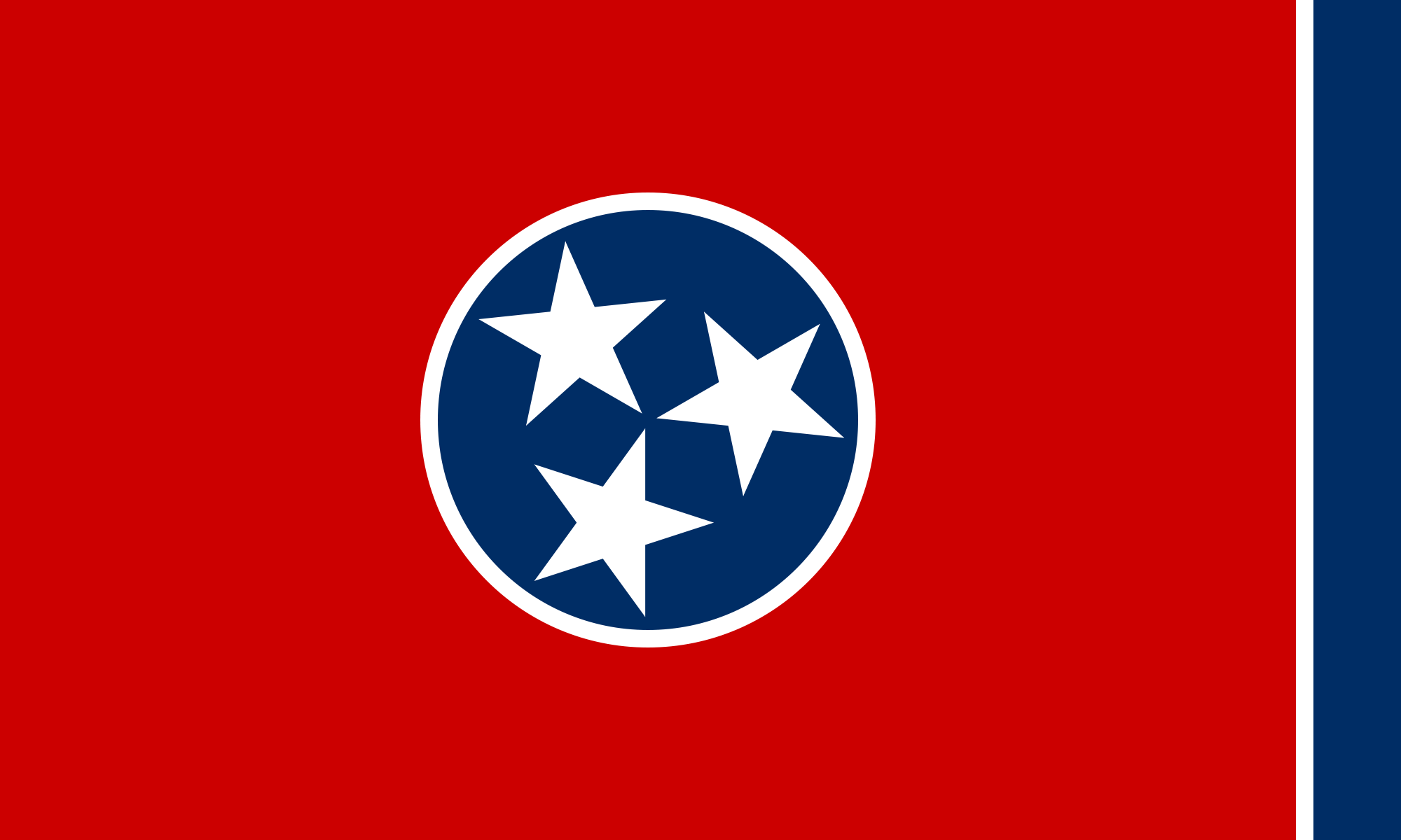
Another simple and clean design. Almost a little too clean and a little boring.
16. Ohio

Ohio gets a lot of credit for going out on a limb and designing a non-rectangular flag. However, the stars look a bit haphazardly placed, like they were struggling to fit them into the design.
15. Alabama

Like Florida’s flag, Alabama’s pays tribute to early Spanish influence. The flag is very similar to Northern Ireland’s flag. However, it is written that Alabama’s flag features St. Andrew’s cross (the same as Scotland’s flag) while Northern Ireland’s flag has St. Patrick’s cross.
14. North Carolina

North Carolina’s flag is another one that ranks highly despite having text. It’s a classic design that just works.
13. Georgia

Similar to North Carolina’s flag, this is another solid flag design that breaks rules for the better featuring it’s state seal in the canton.
12. Hawaii

Hawaii’s flag is a striking design that recognizes its British colonial past while honoring its geography with eight stripes for the state’s eight main islands.
11. Rhode Island

My inner prep loves the classic nautical design and unique shape of Rhode Island’s flag.
10. Indiana

Honestly, I gained an appreciation for this flag from watching Parks and Recreation. It has a good color palate and easily recognizable design.
9. Wyoming

It may be that I have a soft spot in my heart for the American Bison (Genus: Bison, Species: Bison Bison), but I am willing to forgive the state seal for this memorable design.
8. Colorado

Here’s where we get into the flags that are so good that they have become cultural symbols in their own right. This may look like a 70s Chicago Cubs logo, but this bold design is full of Colorado symbolism, giving it top marks in my book.
7. California

The highest ranking for any flag with text. The California flag’s bear straddles the line of being just the right blend of realistic and artistic depiction.
6. Arizona

Arizona’s flag seems to capture the best parts of a desert sunset in one of the simplest ways possible.
5. Texas

There’s are several reason that Texan’s proudly fly their flag, it’s design being one of them. It is a “bigger is better” classic that lovingly embodies Texas’ spirit.
4. Alaska

The Alaskan flag’s simple beauty is enhanced by it’s connection to Alaska’s state song.
3. New Mexico

A North American Vexillological Association (NAVA) poll ranked New Mexico’s flag first among all U.S. state and territory flags. While I appreciate the simple and clean design, it’s connection to New Mexico state history isn’t as strong as it is in the top two finalists.
2. Maryland

My current home state’s flag. I feel like Maryland’s flag is either a “love it” or “hate it” kind of flag. While the NAVA poll I just mentioned ranked it fourth, I’ve seen at least one state flag ranking that placed Maryland’s flag dead last. The first time I saw Maryland’s flag, I was immediately in love. The more I learned about it’s connection to Lord Baltimore, the more my love grew. It’s another one of the flags that “just works” for reasons I can’t really say. However, it is not my favorite flag. (See an in depth post on the Maryland flag here).
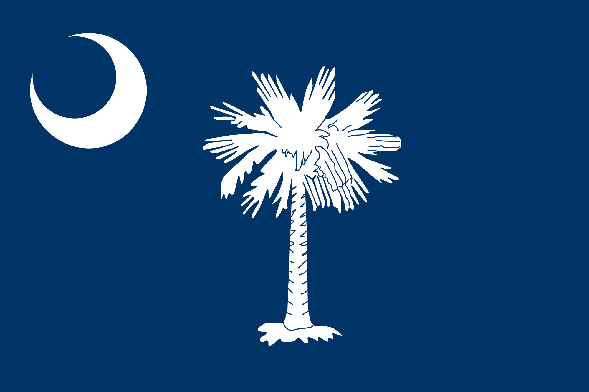
If you know someone from South Carolina, or even someone who vacations there, you’ve probably seen this design on everything from shirts to beer koozies. While I have lamented over the use of trees on previous flags, this design is different. I don’t want to get too much into the iconography of this flag as I will probably do a separate post on it, but the palmetto tree played a huge roll in the survival of South Carolina (and even the U.S.) during the Revolutionary War. To me, it is a beautifully designed flag with plenty of historical significance that S.C. should be extremely proud of. (See an in depth post on the South Carolina flag here).
What do you think of my ranking? Leave a comment to let me know!

So I must admit I never paid much attention to state flags before reading this. I don’t know what my favorite is but I like Rhode Island, Colorado, Arizona, and Alaska best. You’re mentioning of the train gives you something else to have in common with Sheldon!
LikeLike